Oscar Mike is a non-profit organization focused on getting injured veterans on-the-move as well as my current employer. I work primarily on apparel design both for our in-house designs as well as working with our partners like Google, Amazon & Twitch, Starbucks, General Mills, Kel-Tec and more. In addition to apparel graphics, I’m also tasked with designing tri-fold brochures, challenge coins and an occasional marketing email. All work featured here has been conceptualized and completed by me.
Back when the Covid pandemic hit, I was worried about what would happen with my income. Was I losing my job? Would I be living on unemployment? I came up with an idea to make a few extra bucks to put my mind at ease, design and sell stickers. It started slow, but once I found my niche in the comedy & podcast industries, things really started to take off and I was able to branch out into more things I like. Here are a selection of some of my favorite stickers (and other related products) I’ve released to date. You can find them for purchase in the shop here on my website or on my Etsy page.
Branding package for Yappy Hour Mobile Pet Grooming. Client wanted to bring some fun to the mobile grooming industry and already had the perfect name picked out! I took the “drinking” aspect of the name and incorporated a martini glass and olive(s) into a dogs facial features. I had a blast working up all these graphics and the client was ecstatic with the results!
Rock River Disposal is responsible for the waste and recycle management in the Rockford and surrounding areas. Their old logo was tired and boring with no character. I simplified things down to an acronym while maintaining their original orange and navy color scheme. The new logo catches the viewers eye quickly, which is great for a garbage truck because they’re always moving!
Client was in need of branding for their new serious business with a not so serious name. Land Llama is a company based in Florida, USA focusing on the buying and selling of vacant land. The strategy in developing the brand was to straddle that line between professional and fun while delivering a logo that is friendly and approachable.
All Interiors came to me looking to spruce up their branding from their tired word-mark into something a little more appealing. They thought they knew what they wanted but after some conversation I was able to steer them in a different direction.
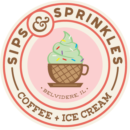
This branding was created for an Ice Cream and Coffee spot located in downtown Belvidere, IL. The logo incorporates a coffee cup made of waffle cone, filled with mint ice cream and topped with sprinkles. Color palette reflects a retro ice cream parlor and the interior design matched.
Work for our Halo LAN event held every month in Milwaukee, WI! All this work was done for fun, not commissioned.
Logo designed for an aerial drone photography company based in Ohio.
Firebox Restaurant & Pizzeria is Belvidere’s first stone-fired pizzeria and Belvidere’s only two story eatery. The logo reflects the shape of the stone ovens and the bold type conveys a solid feeling. Since Firebox is a sister restaurant to Shortline Sushi we kept a similar color pallet and utilized the same supporting typeface. On top of designing all the collateral for the restaurant I was also tasked with designing the tap-takeover cards, social media posts and other collateral.
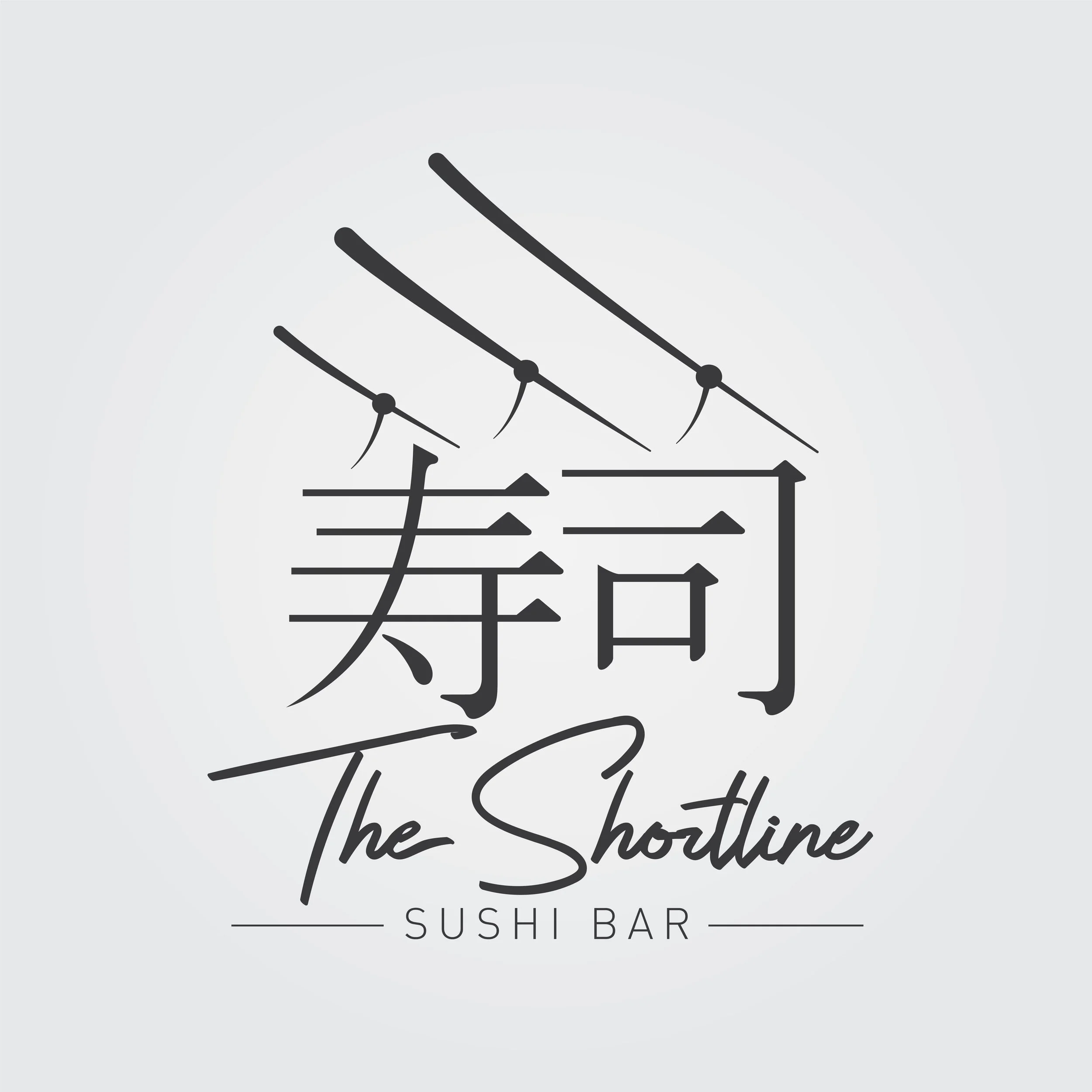
This logo was created for Belvidere Illinois’ first sushi bar. The name comes from the old railroad that ran through town. The trains ran on electricity and were fitted with what's called a pantograph on the top of them. These "pans" would hug the wires supplying the current to the train. The lines above the Japanese characters in the logo represent the power lines and tapering effect is done to represent chopsticks. The Japanese characters here read "Sushi". In addition to designing the logo, I also designed business cards, menus, social media posts and other collateral.
Logo for a Chicago based DJ. Bryan is a computer science graduate who focuses on software development and wanted to tie his love for code with his love for music.
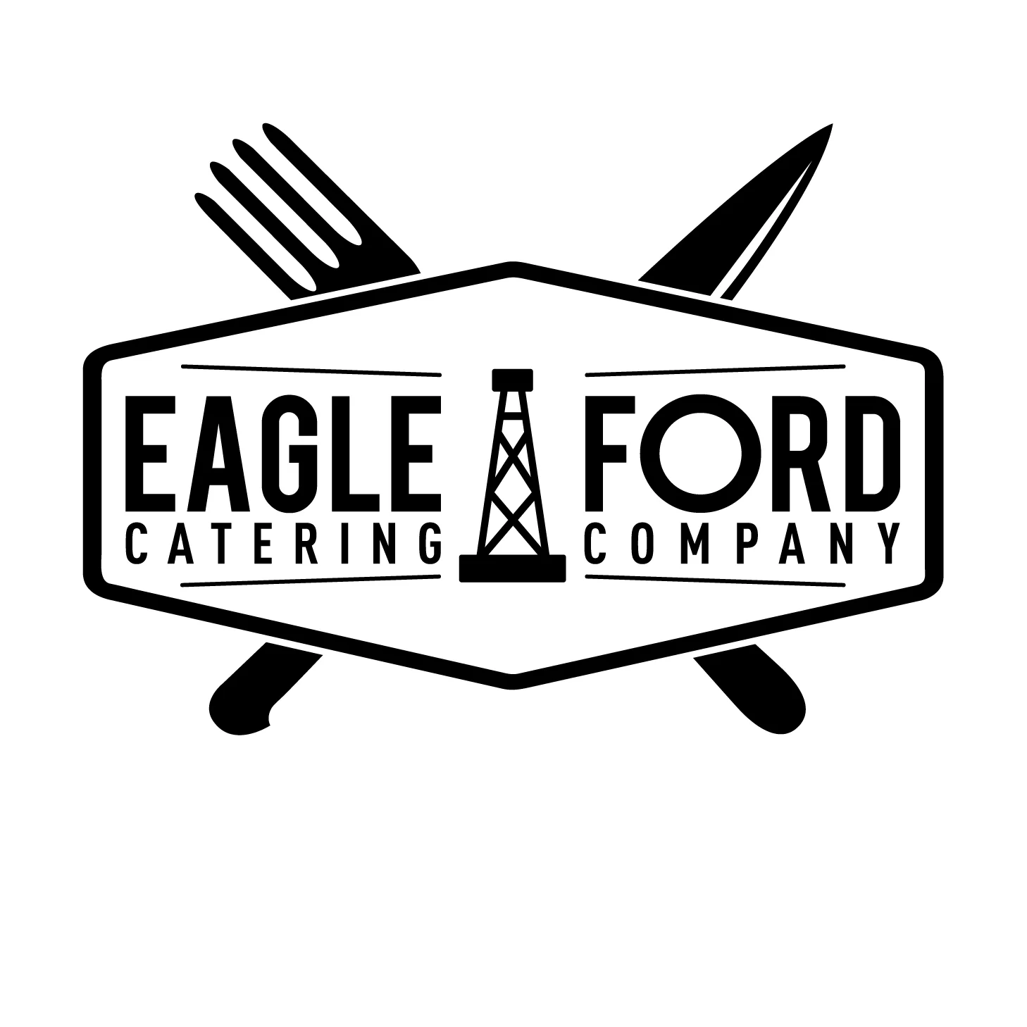
Branding and collateral for a caterer in South Texas who works oil and frac fields exclusively.
Logo designed for another Texas based caterer! Inspiration here was using Texas elements (state shape and steer) and combining them with elements of catering/steakhouse.
Branding for a company that manufactures and distributes custom built dog washes. The only 100% American made dog washes on the market, the client was insistent that the logo reflect this and the core values of the company. The idea here was to emphasize that these units were built TOUGH and built in America.
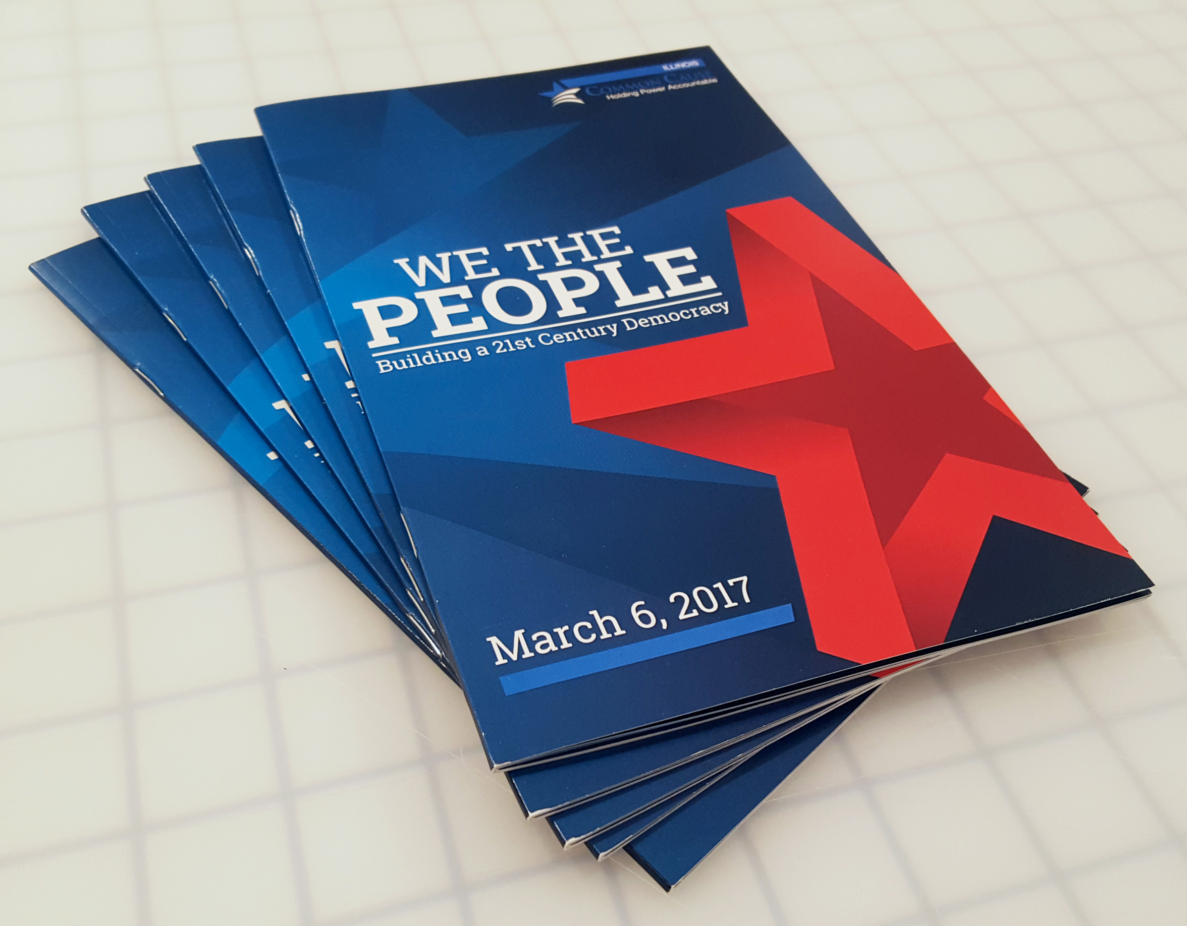
Developed collateral for non-profit organization, Common Cause. Theme to design around was "We The People". Bold, contrasting colors and a slab typeface accompany eye-moving design elements to keep viewers interested while being informed.
Commissioned pieces that don’t have a home.